The second event revolves around new inflation data released this morning. Personal Consumption Expenditures, the Federal Reserve’s preferred gauge of inflation, grew 2.5% between January 2024 and January 2025. This was exactly what the market was forecasting and is a slight decrease from the December release of 2.6%.
For this week’s note, we’re using several year-to-date performance charts to break down key market dynamics so far in 2025.
Magnificent 7 Hitting the Brakes
In the chart below, you can see the year-to-date performance of the S&P 500 ETF SPY (navy) and the Defiance Large Cap ex-Mag 7 ETF XMAG (light blue).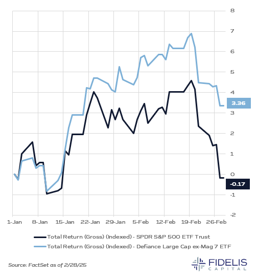
As indicated by its name, XMAG is an ETF that tracks the S&P 500 excluding the Magnificent Seven. After spending much of the last two years pulling the entire market higher, Apple, Microsoft, Alphabet, Amazon, Nvidia and Tesla are all negative performers so far this year. Meta is the only of the Magnificent Seven with positive performance.
This chart highlights the theme of market concentration. Due to their large market cap, these stocks have pulled the S&P 500 down to an essentially flat start to 2025. If we exclude these names and focus on the rest of the market (think S&P 493), we see a relatively upbeat start to 2025. After the past few years, when it felt like only a few stocks were carrying the market higher, broader participation across the market is a welcome sign.
Growth vs. Value: A Similar Story
The chart below again represents year-to-date performance. The iShares Russell 1000 Value ETF IWD (navy) is plotted along with the iShares Russell 1000 Growth ETF IWF (light blue).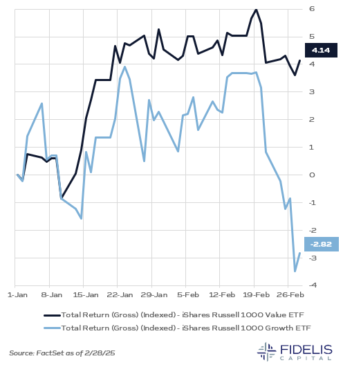
This chart reflects a macro trend in the market: value has outperformed growth so far in 2025. Healthcare, Financials, Real Estate and Energy are the top four performing sectors. Technology and Consumer Discretionary are the only two negative sectors.
Again, the theme of “everyone else” participating is a positive signal for market strength. We certainly believe in growth’s long-term performance, but this environment is a good reminder of the importance of diversification in portfolios.
Gold: Digital vs. Physical
One more year-to-date performance chart, but this time we’re plotting the SPDR Gold Shares ETF GLD (navy) versus Bitcoin (light blue). GLD is an investable proxy for physical gold.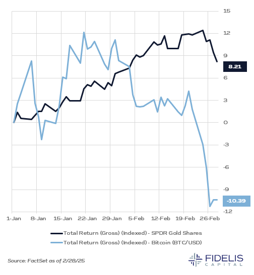
As bitcoin has become more mainstream, one of the primary arguments for holding it centers around it being a digital version of gold. Both are not controlled by any one government and can be considered stores of value. This would lead one to believe that both assets can be safe stores of value and used as a hedge in portfolios.
After the election, bitcoin rallied a staggering 34.46% to close out 2024. Since the start of 2025, however, its performance has been largely negative. Gold, on the other hand, has had a strong and steady start to the year. We are hesitant to buy into the thesis that bitcoin can replace gold as a volatility hedge in portfolios, and recent swings in the price serve to highlight that it remains a speculative asset. Gold is old school, but it continues to serve as a tried-and-true diversifier for portfolios.