The Latest from Chair Powell
Powell’s commentary on Wednesday was not well received by equity markets. Since Liberation Day, the market has quickly priced in more aggressive Fed action this year in the form of interest rate cuts.Powell took a measured tone in this public appearance but seemed to indicate that the market should not expect the Fed to be in a major rush to cut rates at its next meeting in May. The Fed, like the rest of us, is trying to track the impact of the recent tariff policy in real time but will continue to rely on the hard data, which is reported on a lag.
His comment that “we may find ourselves in the challenging scenario in which our dual-mandate goals are in tension” was taken by the market as a sign that the Fed sees the risks to its goals of maximum employment and price stability as roughly balanced. As tariff headlines slow down and we get closer to summer, expect the spotlight to shift more toward the Fed and its policy decisions.
The Trade Balancing Act in Charts
Given the headlines surrounding global trade, we’ve spent some extra time in the last few weeks reviewing historical trends related to the U.S. trade deficit. We’re sharing three charts that best explain how we got here.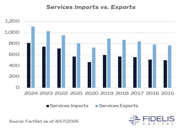
This first chart above shows the last 10 years of services imports versus services exports. It’s clear the U.S. has consistently been a net-exporter of services. As our economy has grown and developed, services jobs have become more commonplace.
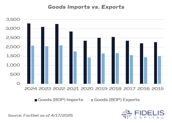
This second chart shows the last 10 years of goods imports against goods exports. The opposite is the case here, as the U.S. has been a net-importer of goods since 1992, as far as our data goes back. This chart also does a good job of showing how the economy strengthened since Covid. You can see a step upwards starting in 2021, which coincides with the reopening of the economy and the plethora of fiscal stimulus received during the pandemic.
The takeaway from these first two charts is that, over the last decade, the U.S. has consistently exported services and imported goods. Goods comprise a much larger portion of the total economic activity, which leads to a larger impact on our total balance of payments. A quick review of this data would echo the story that the U.S. has lost ground in manufacturing and exporting goods but remains a stalwart when it comes to services.
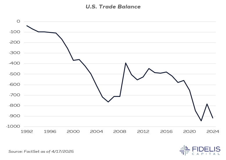
This final chart shows the trade balance going back to 1992. The trade balance (or balance of payments) is calculated by subtracting our net imports from our net exports. This chart shows that we have been in a trade deficit since 1992. The deficit stabilized during the economic malaise following the Great Financial Crisis, but the deficit’s growth rate accelerated in the post-pandemic recovery.
These charts are a big driver of the administration’s policy making, as they’d like to see these trends start to reverse. These do not change overnight as these economic relationships have been developed over the last few decades, but this year will likely show some changes in these figures given the policy shifts that the administration is attempting to drive.
In sum, these charts show how the balance of payments has tilted away from the U.S. being a major exporter of goods. We would emphasize that trade deficits are not inherently a bad thing. They can, however, develop because of anti-competitive practices from nations that we trade with.
It is easy to see how this period of globalization has impacted the trade deficit negatively. Dissecting which trade relationships are the primary drivers of this imbalance is critical, and we will be watching negotiations with the countries whose reciprocal tariffs were paused to look for indications of the administration’s priorities when it comes to addressing the trade deficit.